what is the octomind design system?
Octomind is a software testing SaaS platform with fairly sophisticated UI. From the very beginning, we put effort into a good UX/UI. Design of the product was an inevitable part of it. Here are some details about how we've built our design system.
Good "how we made" stories tend to contain some kind of twist and relevation about how we came up with a new approach to design systems and failed many times, but learned from our failures and finally ended up with a better version or something. But the truth is - we knew how to build a good design system, we designed it, we built it, it worked like a charm, end of story. Here are some details about it if you are into this kind of thing:
The Octo design system foundation
The foundation layer contained the following tokens:
- colors
- typography
- effects
- paddings and margins
Colors and tokens
Our colors were very carefully designed not just to look good, but to be perfectly functioning as tokens.
The color tokens had two layers. Base tokens for the raw colors and functional tokens, this way they can easily updated in isolation if needed, but still only in one central place.
Some interesting mechanics that play well together:
- every second layer token was using the same value base token as a reference for the same functionality. Example: text tokens are derived from value 20 tokens and background tokens are derived from value 80 tokens
- every token with a value of 50 or less should be AA compliant with dark text and every token with greater or equal value are AA compliant with light text
- every same value token has the same level of color contrast in accordance to different value tokens, therefore it is very easy to know which can be combined with which token to achieve certain accessibility standards
Even if a developer randomly assigned a text style to a text on a randomly assigned background, it will always be readable in at least AA level of the WCAG accessibility standard! It was literally impossible to do less accessible UI than designed.
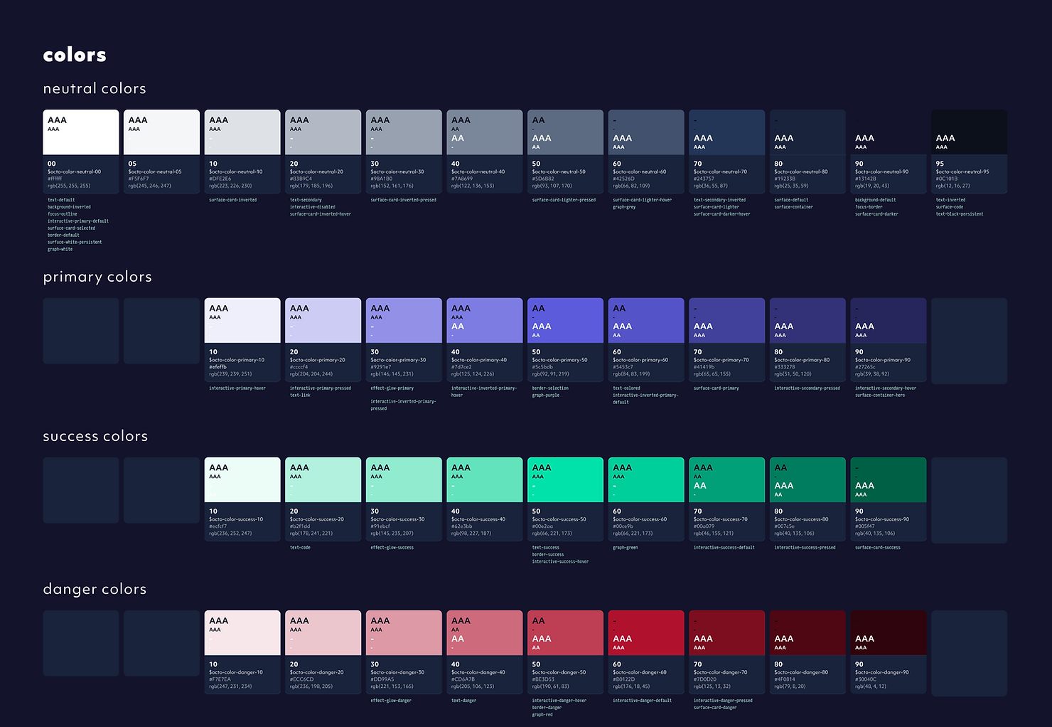
There were even more colors for graphs, gradients for hero items and some transparent tokens in the system as well with a similar logic as the base colors.
Hierarchy
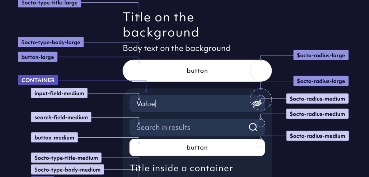
The hierarchy of the elements in Octo Design System was also very precisely designed so its not only easy to use, but basically dictates usage to whoever is working with it.
Typographic styles, border radiuses, effects, margins and paddings, element sizing and so on could have 3 sizes: Large, Medium or Small. From here on the logic was simple:
- on the body large value entities can go (large title, large card with a large border radius, etc...)
- inside large elements go the medium elements
- in medium elements go the small elements
- nothing goes in small elements
These rules not only helped us create a hierarchy that makes sense to our users, but also prevented us from making unsatisfactory solutions:
- we couldn't nest infinite elements in each other, therefore our UI remained simple with a maximum of 3 levels of objects
- we couldn't fall into the trap of UI scale-shift, where the elements are just progressively growing or shrinking as the designs evolve
Once again it was impossible to design or develop something that didn't meet our predefined standards.
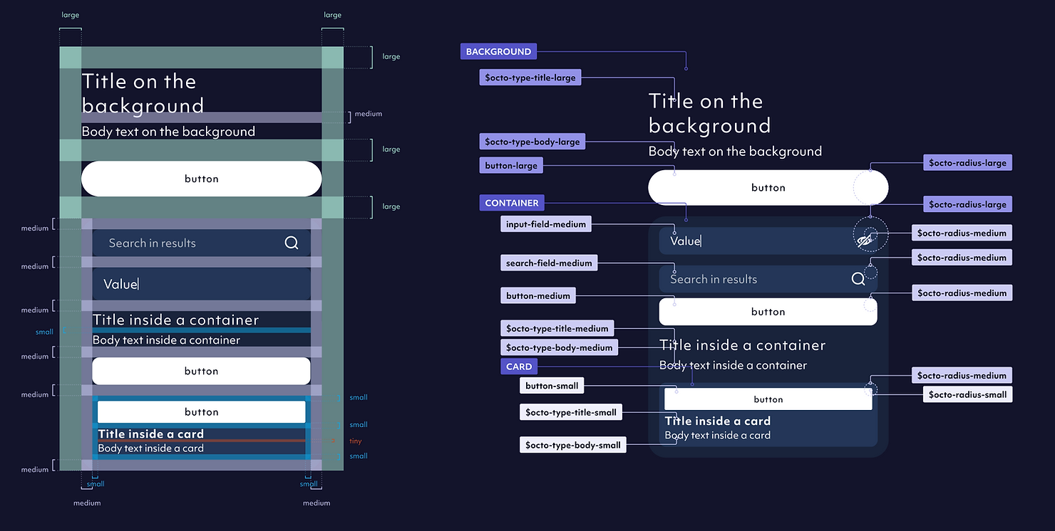
An additional visual eye-candy that I absolutely loved was that the size of border radiuses and their parent components' internal paddings were synchronized in a way that elements nested in each other always had the same centerpoint for the circular shape that defined their border radius (see octo-radius-small and octo-radius medium on the picture above). Not only this looked nice, but if something was nested in the wrong element, it was very easy to spot even for someone who is not so design-savvy.
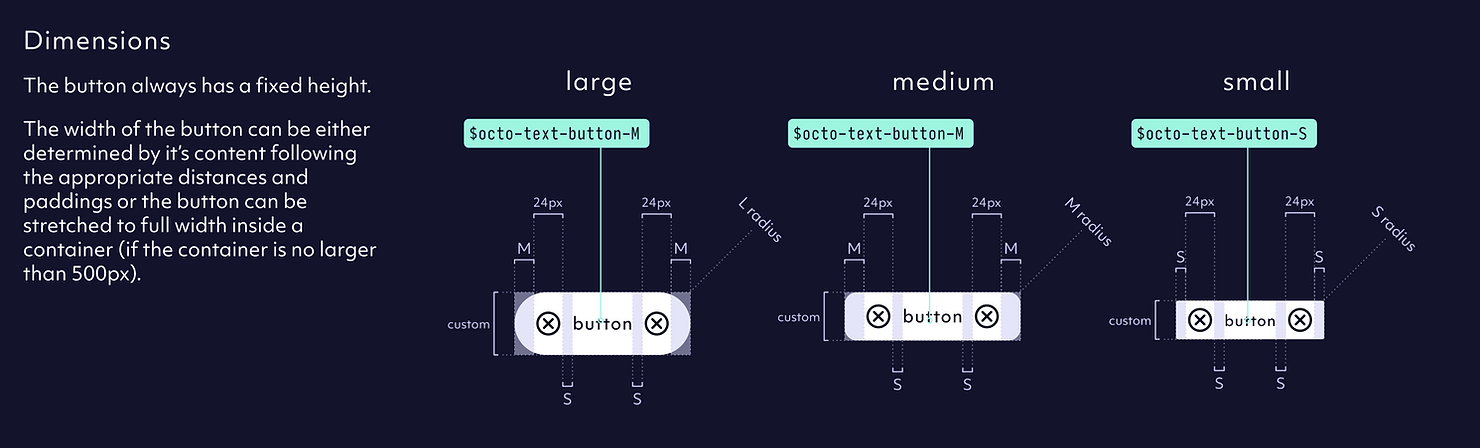
Component layer
Nothing extravagant here, our components followed the same sizing (L-M-S) and were hosted in Storybook where devs could try them out before using them.
Our next step was to create component-combinations or patterns that were commoly used groups of components.
Icons
Icos are mostly part of the Branding topic, but from a design system perspective an interesting quality of life feature we created was the automatic syncing of the icons from Figma to our repo without any manual work. Ok, a little manual work, there was a sync button in GitHub that you needed to press.
Of course this meant that whatever was in Figma got into the app directly - we had a some mechanics to avoid large failures, but a lot of discpline was needed from the design side, therefore we wrote down some rules.
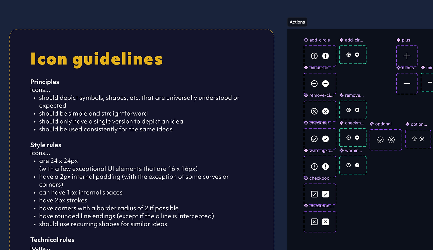
Why did we decide to invest in a design system in the first place?
A design system is one of the smartest investments you can make when building a SaaS product. It keeps your product consistent, cohesive, and fast to build. Instead of designers and developers reinventing buttons, colors, and layouts every time, everyone works from the same playbook. That means fewer design inconsistencies, faster releases, and a smoother experience for users. It also keeps your brand recognizable and your interface predictable - two things that quietly build trust and make your product feel polished.
As your SaaS grows, a design system becomes even more valuable. It scales with you, making it easy to update visuals, maintain accessibility, and roll out new features without breaking the experience. It gives your team leverage - you move faster and spend less time fixing small UI issues. In short: a good design system helps you build better software, faster, and keeps chaos at bay as your product evolves.

Dániel Z. Aczél
UX lead